Last Updated on July 30, 2020
Blog Color Resources
Why is color important?
Color increases brand recognition by 80%.
A recent case study showed that adjusting color, among other elements, can increase conversion by as much as 24%.
Choosing Colors
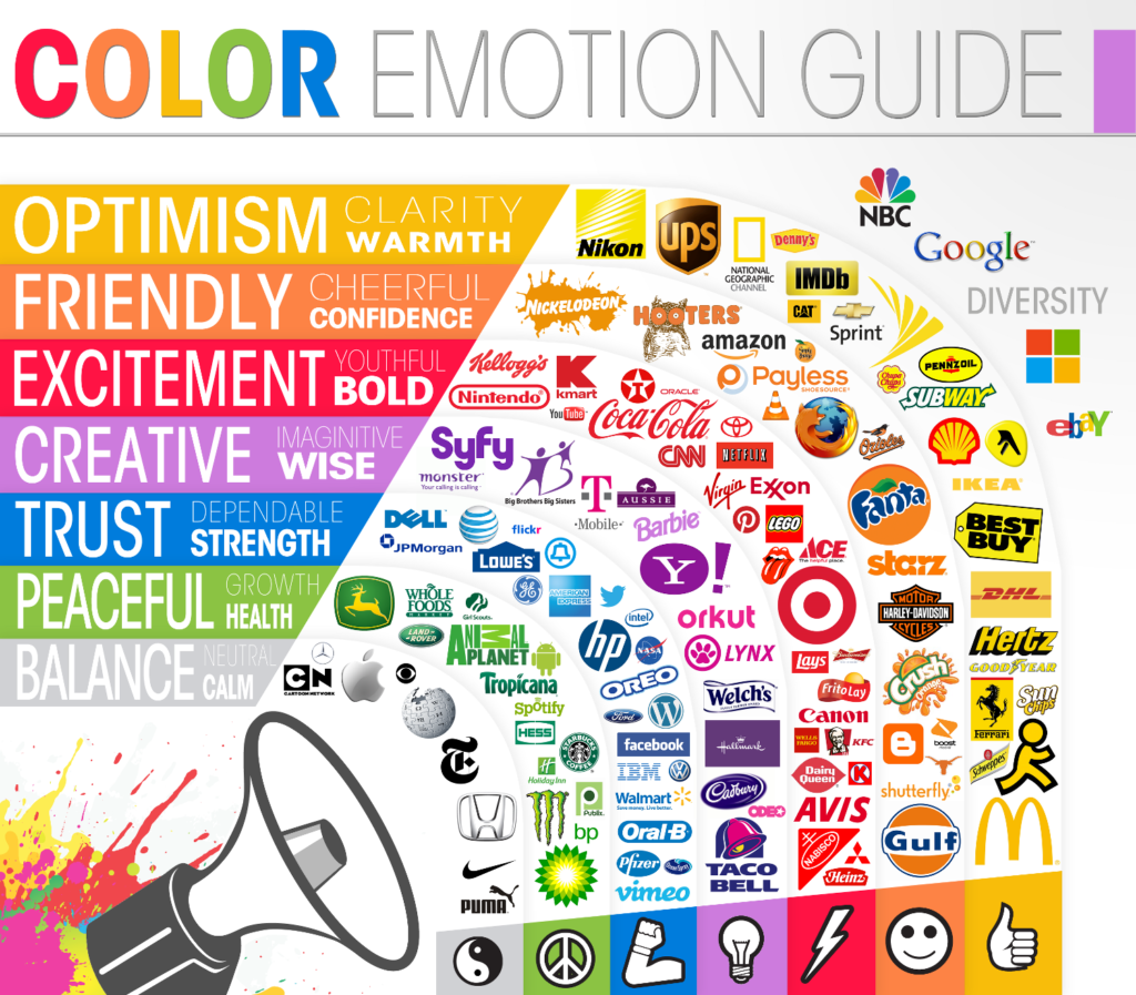
Yellow: warnings, joyful, energetic
Orange: create a sense of haste or impulse. confidence, success, and courage
Red: stimulating and lively color. It can also be viewed as demanding, powerful, or intense. Red is associated with love and passion as well as warmth and comfort
Pink: feminine, sweet and compassionate
Purple: luxury, wealth, ambition and nobility
Blue: most used color, cultivate user’s trust, stability, and responsibility
Green: environmental and outdoor products. harmony and balance. But it can also represent growth and money
White: copious use of white space is a powerful design feature
Example: Google
Black: adds a sense of luxury and value
Example: Lamborghini
Popular Colors
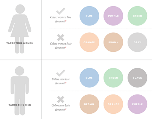
57% of men and 35% of women say blue is their favorite color.
Women don’t like gray, orange, and brown. They like blue, purple, and green.
Men don’t like purple, orange, and brown. Men like blue, green, and black.
Color Schemes
1 – 3 Main Colors
These colors will be used for 70% of your branding.
1 – 2 Accent (Pop) Colors
1 – 2 Neutral Colors
Types of Color Schemes: analogous, monochromatic, complementary, and triadic
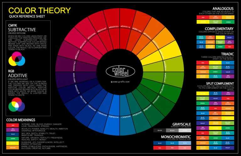
Analogous
colors that fall side-by-side on the color wheel
colors can overpower each other
some of the most vibrant color schemes
Monochromatic
made up of one main color (hues and shades)
easy to use and almost never clashes
great for a simple look
Complimentary
colors that are opposite one another on the color wheel
adds variety but not overwhelming
Triadic
3 colors that that are 120 from one another, forming a triangle on the color wheel
some consider this to be the best color scheme
Examples
- Analogous color scheme: https://useless.london/
- Monochromatic color scheme: http://blank.com.pt/ and https://www.odopod.com/
- Complementary colors: https://www.giovanniranausa.com/ and https://naturestable.com/
- Neutral shades in the brown family make it an overall earthy color palette: https://www.mint.com/
- Black and white: https://briangardner.com/
- Jewel Tones https://bigtop.co/
Calls-to-Action
The highest-converting colors for calls-to-action are bright primary and secondary colors – red, green, orange, yellow.
Darker colors like black, dark gray, brown, or purple have very low conversion rates. Brighter ones have higher conversion rates.
Resources
SItes to help you pick colors:
- COLOURlovers: Color Trends + Palettes
- Pictaculous
- Cohesive Colors | Create more cohesive color palettes.
Test you Colors
Templates